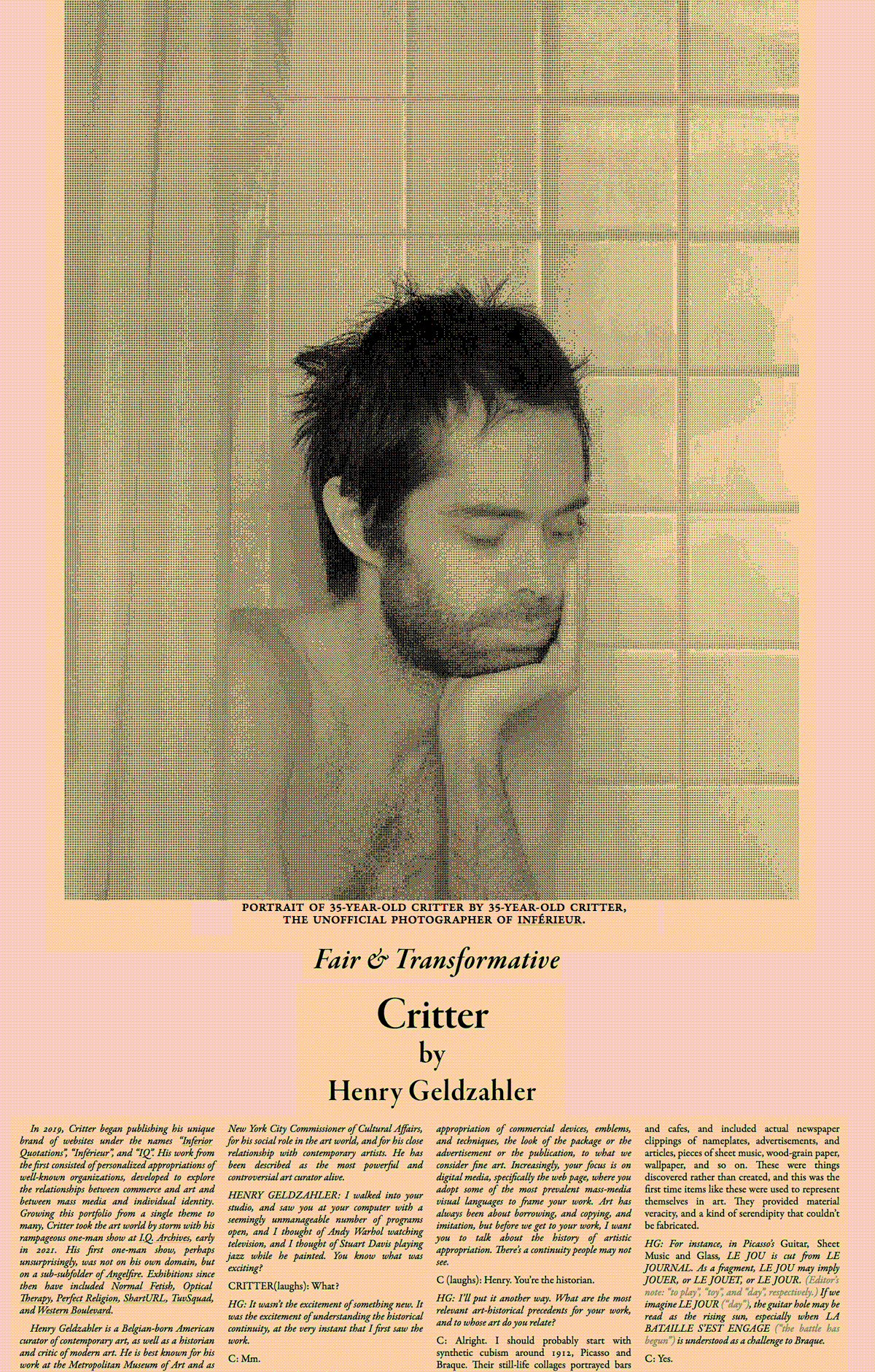
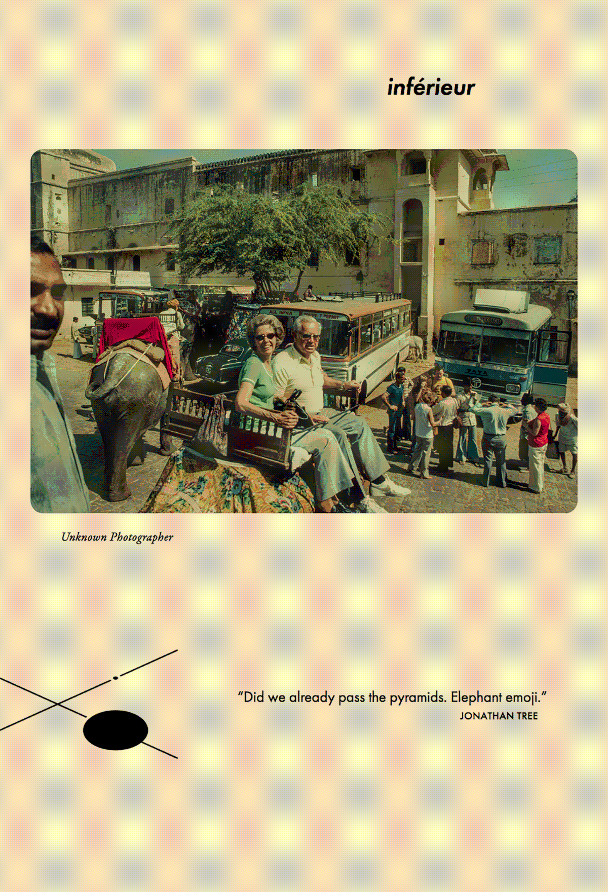
Portrait of 35-year-old Critter by 35-year-old Critter,
the unofficial photographer of
inférieur.
Fair & Transformative:
Artistic Appropriation
& Copyright Law
Critter
by
Henry Geldzahler
Editor's note: This interview covers three topics, beginning with a condensed history of appropriation art, followed by fair-use justifications for Critter’s art, and ending with a discussion of Critter’s work.
In 2019, Critter began publishing his unique brand of websites under the names “Inferior Quotations”, “Inférieur”, and “IQ”. His work from the first consisted of personalized appropriations of well-known organizations, developed to explore the relationships between commerce and art and between mass media and individual identity. Growing this portfolio from a single theme to many, Critter took the art world by storm with his rampageous one-man show at I.Q. Archives, early in 2021. His first one-man show, perhaps unsurprisingly, was not on his own domain, but on a sub-subfolder of Angelfire. Exhibitions since then have included Optical Therapy, Perfect Religion, and ShartURL.
Henry Geldzahler is a Belgian-born American curator of contemporary art, as well as an historian and critic of modern art. He is best known for his social role in the art world, his close relationship with contemporary artists, and for his work at the Metropolitan Museum of Art and as New York City Commissioner of Cultural Affairs. He has been described as the most powerful and controversial art curator alive.
HENRY GELDZAHLER: I walked into your studio and saw you using the computer, and I thought of Andy Warhol watching television, and I thought of Stuart Davis playing jazz while he painted. You know what was exciting?
CRITTER(laughs): What?
HG: It wasn’t the excitement of something new. It was the excitement of understanding the historical continuity, at the very instant that I first saw the work.
C: Mm.
•
HG: Art has always been about borrowing, copying, and imitating. Like that of many before you, your art is an appropriation of commercial devices, emblems, and techniques, the look of the package or the publication, to what we consider fine art. Increasingly, your focus is on digital media, specifically the web page, where you adopt some of the most prevalent mass-media visual languages to frame your work. I want to discuss your recent projects, but first I want you to talk about the origins and history of artistic appropriation. What are the most relevant art-historical precedents for your work? To whose art do you most relate? There’s a continuity people may not see.
C: Okay. Let’s start with synthetic cubism around 1912. To replicate the atmosphere of bars and cafés, Picasso and Braque included actual newspaper clippings of nameplates, advertisements, and articles, pieces of sheet music, wood-grain paper, and pieces of wallpaper in their still-life collages. These were things discovered rather than created, and it was the first time items like these were used to self-referentially in art. These fragments provided material veracity, and a kind of serendipity that can’t be fabricated.
HG: Picasso’s Guitar, Sheet Music and Glass is a great example. LE JOU can be read as LE JOUR (Editor’s note: “day” in English.), with the guitar hole reading as a rising sun, corresponding with LA BATAILLE S’EST ENGAGE (“the battle has begun”).

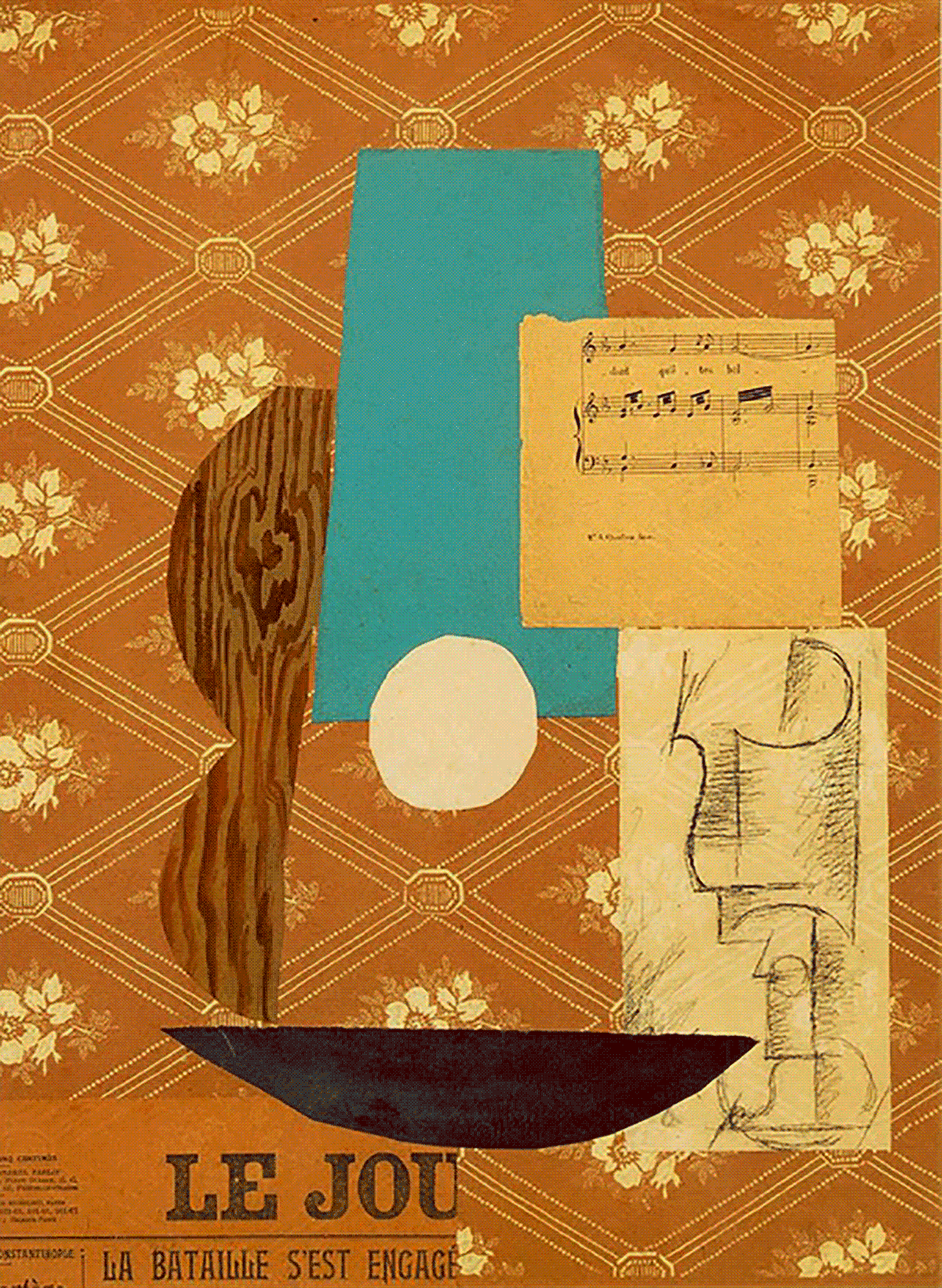
Critter, “Variations: Le Journal & Guitar, Sheet Music and Glass,” 2021, GIF
s, 1200
PX × 1641
PX.
Sharts by
ShartURL, Courtesy
Khan Academy &
SlideServe.
C: Exactly. New expressions, multiple meanings.
HG: I see a similar ambiguity in your branding where Inferior Quotations implies a second-rate selection, IQ connotes intelligence, while Inférieur suggests its opposite. Yet you use them interchangeably.
C(laughs): I… delight in this contradiction.
HG: So there’s synthetic cubism. Then what?
C: Well, in the midst of synthetic cubism, Marcel Duchamp began authoring readymades. These were common objects elevated to the dignity of works of art by the mere choice of the artist.
HG: In other words, by simply choosing the object, repositioning or joining it with others, titling and signing it, the found object became art.
C: Yes, and these readymades challenged conventional notions of originality and authorship. In 1913, Duchamp mounted a bicycle wheel on top of a stool, and titled it Bicycle Wheel. He chose objects based on visual indifference. This was his rejection of retinal art, or art intended to please the eye, in favor of art to please the mind.
HG: The foundation of conceptual art.
C: Yes. Then in 1915, two years after Bicycle Wheel, he made In Advance of the Broken Arm, a snow shovel hung from the ceiling. Then there was Fountain in 1917, a urinal laid flat on its back. Oh, you’ll like this. A poll of five hundred art experts named Fountain the most influential modern art work of all time.
HG: When?
C: 2004.
HG: I would not have chosen Fountain.
C(laughs): I know. So moving on, in 1919 Duchamp drew facial hair on a Mona Lisa postcard, and titled it L.H.O.O.Q.. It seems trivial and harmless now, but the French saw this as an attack on their most treasured work of art. The title in French sounds a lot like Elle a chaud au cul, which translates in English to Her ass is hot.
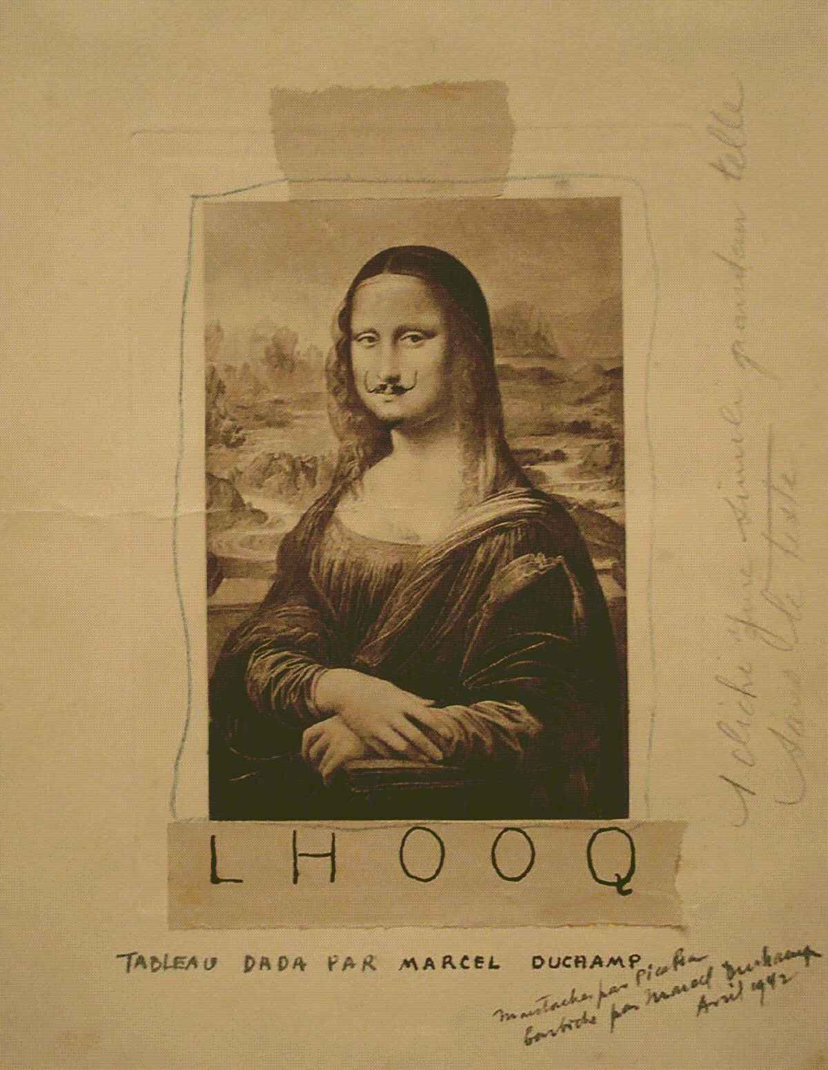
Critter, “Variations: Mona Lisa & LHOOQ,” 2021, GIF
s, 1200
PX × 1550
PX.
Sharts by
ShartURL, Courtesy
Wikipedia.
HG: To the French, this was quintessence desecrated. But Duchamp’s artistic purpose was significantly strengthened by that very quintessence, the culture and attitudes of the audience, and their familiarity with and reverence for the Mona Lisa.
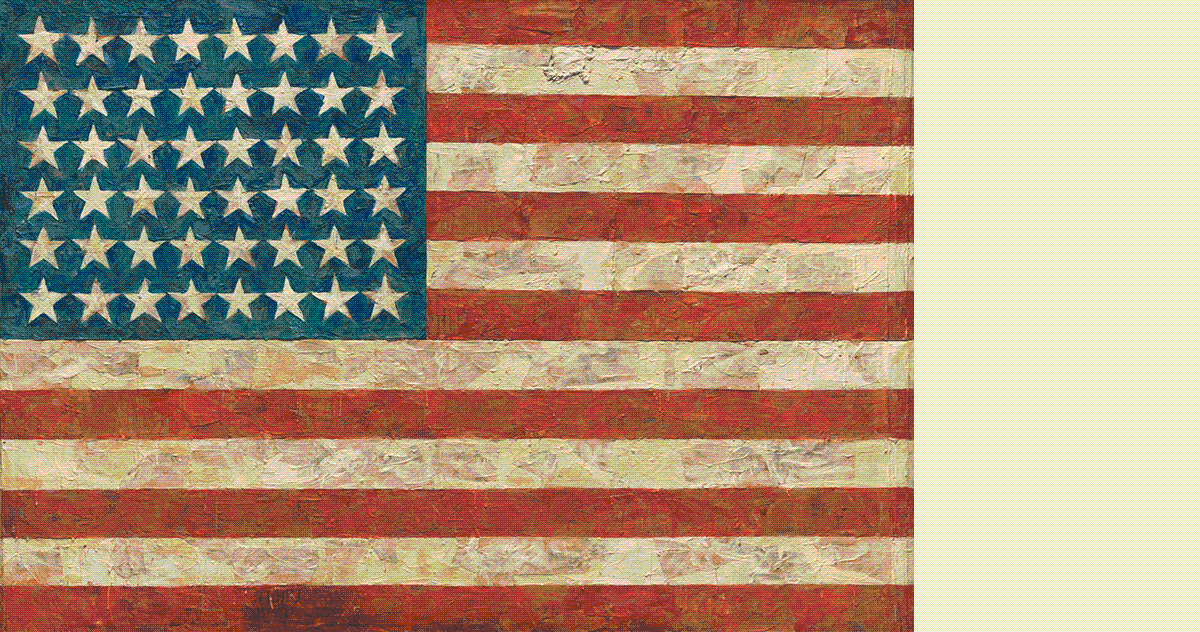
C: Exactly. That gesture would lack effect on an anonymous portrait. Duchamp gives the Mona Lisa a different character, a new expression. Thirty years later, Jasper Johns achieved similar results with Flag. Like Duchamp, Johns was drawn to familiar imagery, things the mind already knows. He said using a recognizable image took care of a great deal for him because he didn’t have to design it. The form was essentially a template, and it allowed him to concentrate on other aspects like technique, material, and meaning.
HG: In fact, MoMA’s Board of Trustees initially objected to Flag because of its potentially unpatriotic character.

Critter, “Variations: The American Flag & Flag,” 2021, GIF
s, 1200
PX × 632
PX.
Sharts by
ShartURL, Courtesy
Wikipedia &
MoMA.
C: Right, it’s open to interpretation in a way that an ordinary American flag is not. Flag forces us to reevaluate a thing we think we know, a thing we take for granted. With work like this, Johns and his peers ushered in Pop art and postmodernism, and this brings us to one of your favorite pals.
HG: Andy.
C: And you know he was really productive in the early ’60s. Campbell’s Soup Cans at Ferus. Marilyn Diptych. Green Coca-Cola Bottles. 129 DIE IN JET!. All artistic appropriations inspired by commercial enterprise, pop culture, and mass media. He said you gave him the idea for the Death and Disaster series.
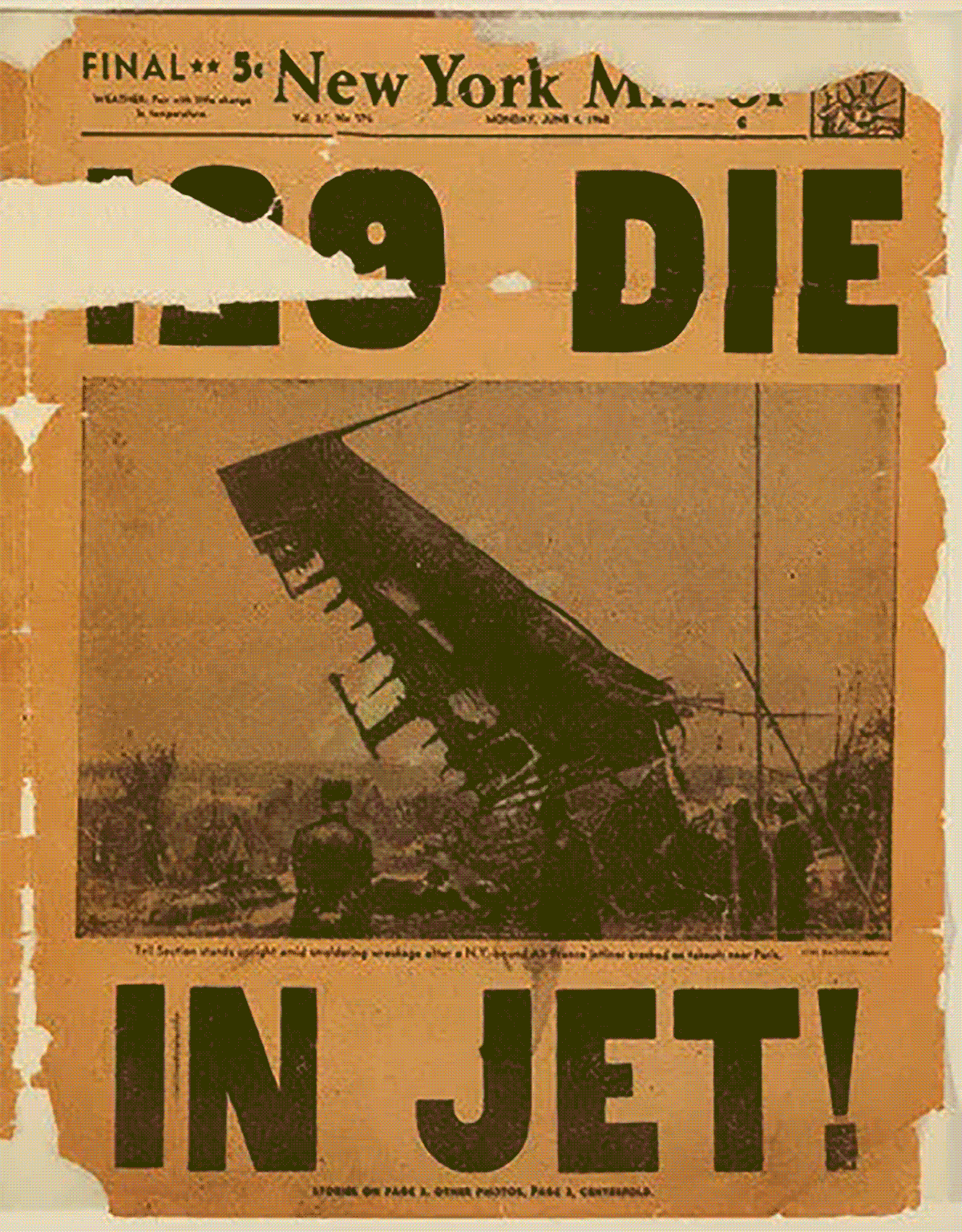
ANDY WARHOL: It was Henry who gave me the idea to start the Death and Disaster series. We were having lunch one day in summer… and he laid the Daily News out on the table. The headline was ‘129 DIE IN JET!’ And that’s what started me on the death series, the car crashes, the disasters, the electric chairs.
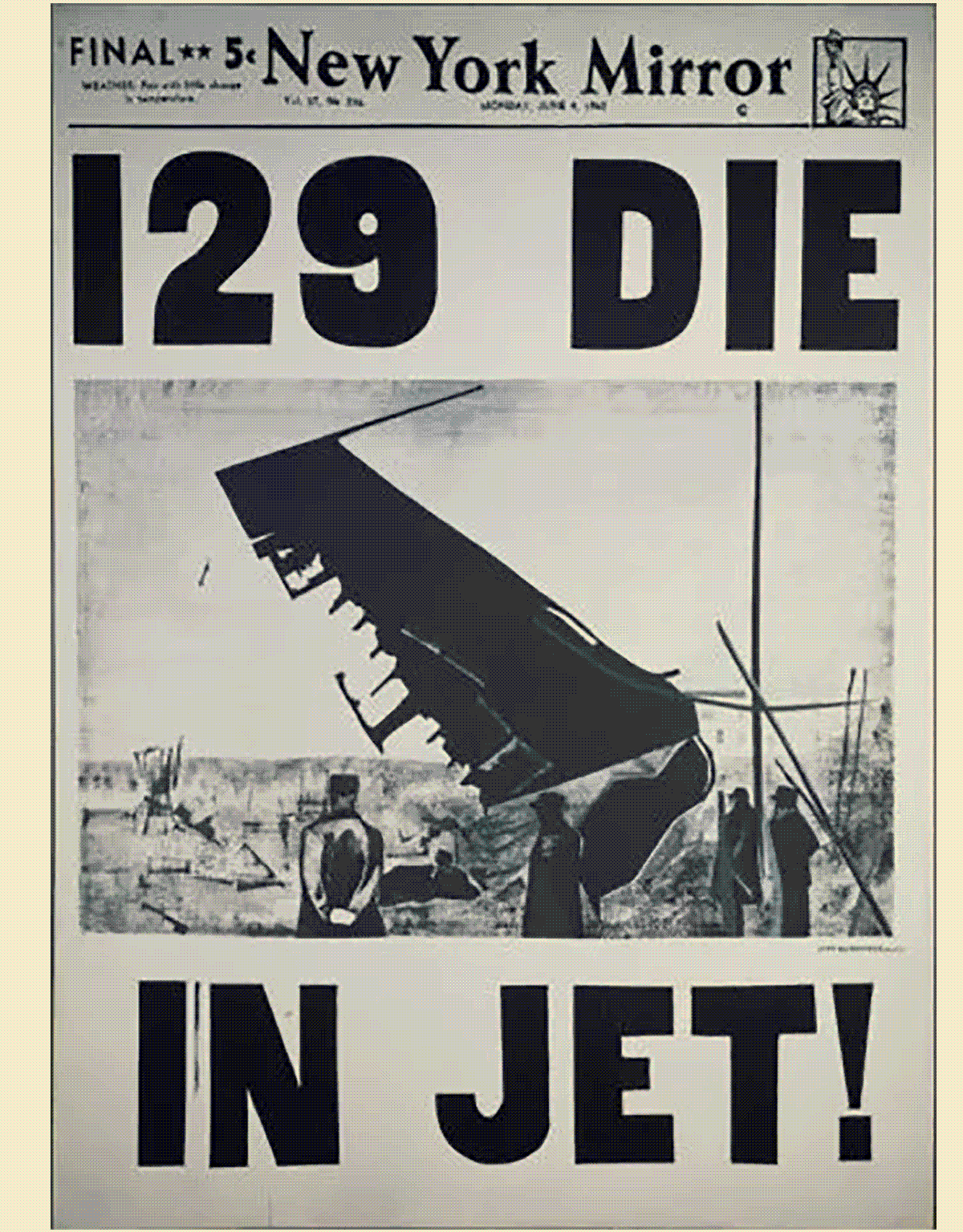
HG: Yes and several years later, on our way to the New York World’s Fair of 1965 I said, Enough death Andy, it’s time again for life. What do you mean, he said. I serendipitously picked a magazine off the floor and flipped it to a two-page advertisement with a color photograph of flowers. These were my best contributions.
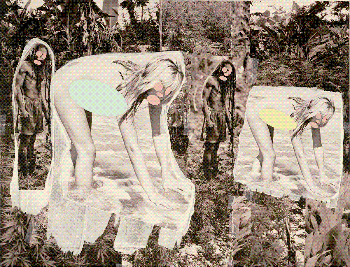
C: So Andy reduced the flowers photograph to black and white, and made the screens for Flowers. Shortly after he printed the canvases, he lent the screens to Elaine Sturtevant, and she made her own Warhol Flowers. To people unaware of Warhol’s cooperation, Sturtevant’s production of Warhol Flowers could be mistaken for copies, rip-offs, or forgeries, and not works of art in their own right, with their own author.
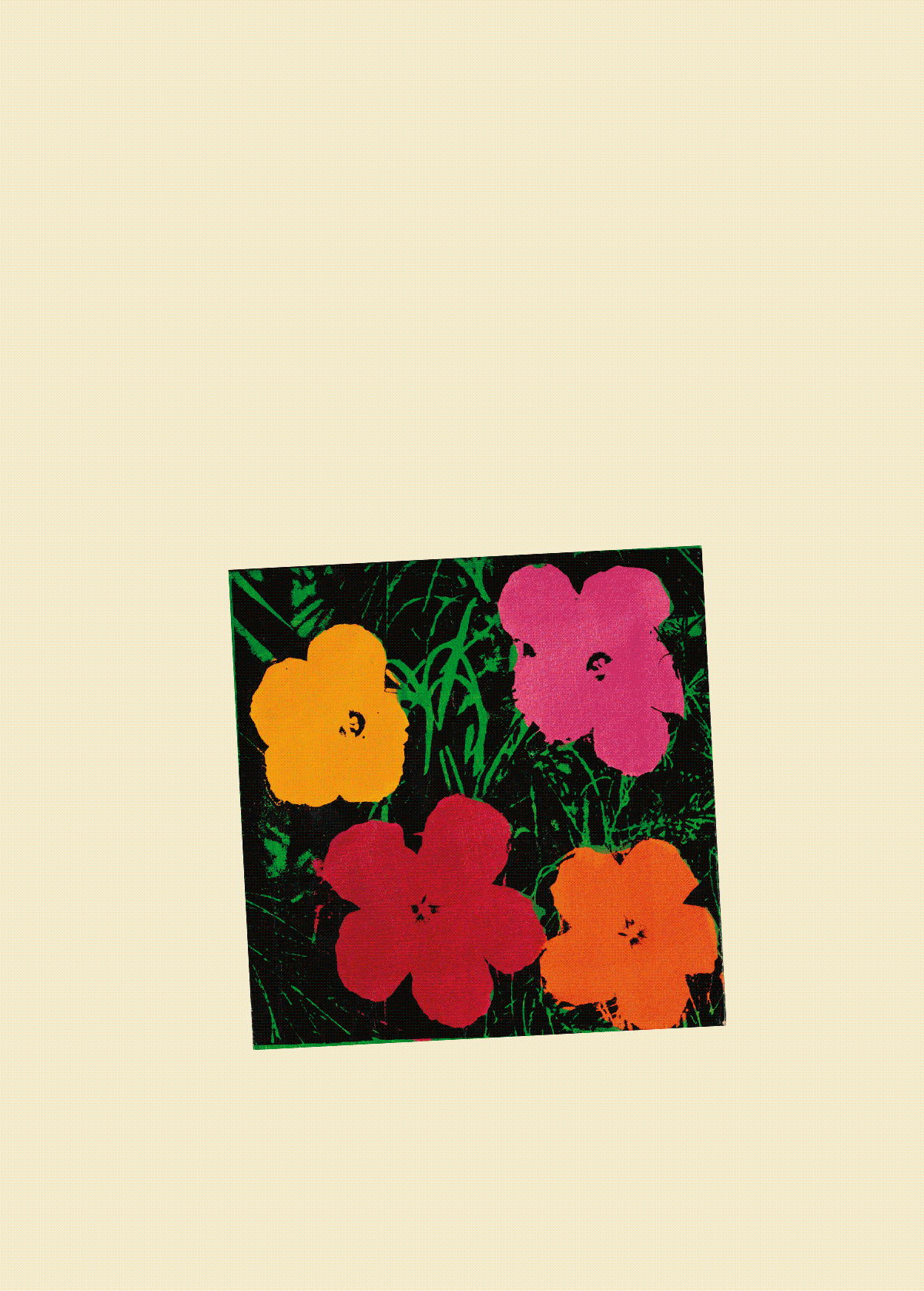
Critter, “Variations: Patricia Caulfield & Elaine Sturtevant,” 2021, GIF
s, 1200
PX × 1676
PX.
Sharts by
ShartURL, Courtesy
Sotheby’s.
C: This further complicated ideas of authorship, originality, and authenticity. Patricia Caulfield, who was the Executive Editor of Modern Photography, was also the photographer of the flowers. She eventually recognized her image in Warhol’s prints, sued him in 1966, and they settled out of court. Because fair use is determined on a case-by-case basis, and because the case wasn’t decided, we can’t know if Flowers made fair use of its source material. I doubt Warhol could’ve made the argument for fair use in the ’60s, but I think he could make it now.
HG: Why do you say that?
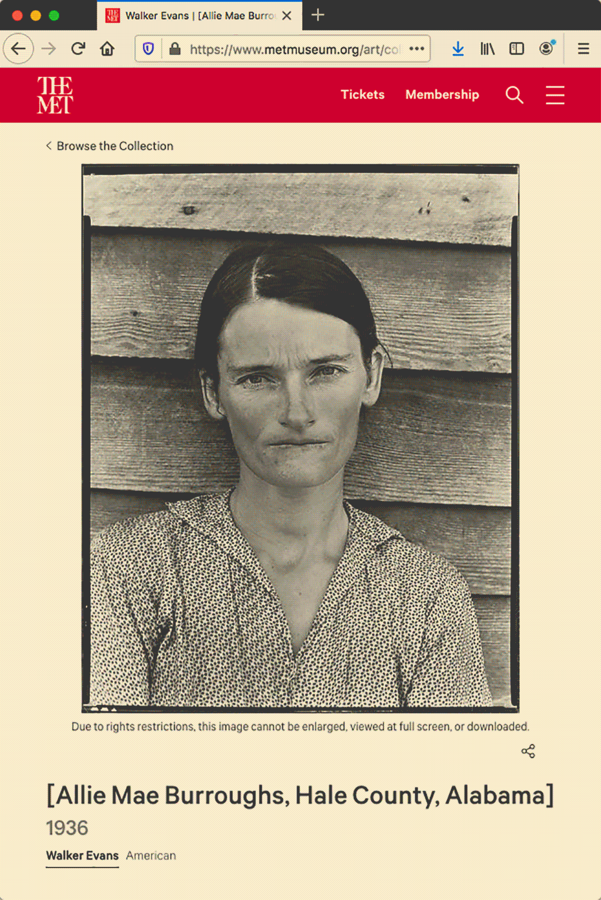
C: Well, fair use wasn’t enshrined in copyright law until the Copyright Act of 1976. And in more recent cases like Blanch v. Koons and Cariou v. Prince, comparable acts of appropriation were found to be transformative and fair. I’ll get to those cases in a minute. First, Modern art critics criticized Pop for its uncritical acceptance of, and appeal to pop culture. Media culture finally received its critique in the late ’70s by a group of younger artists who were influenced by Pop and Conceptual art, post-structuralism, and a culture flooded with images. These artists came to be known as the Pictures Generation. They analyzed, appropriated, and deconstructed mass media imagery, and demonstrated how such imagery is fabricated to reinforce stereotypes, and to seduce and sell. Their art provoked viewers to reevaluate conceptions of originality, authorship, authenticity, and identity. Sherrie Levine was one of the artists featured in the original Pictures exhibition at Artists Space in 1977. In 1981, she made After Walker Evans, a series photographs she took of reproductions of Walker Evans’s photographs.
Critter, “Variations: Walker Evans & Sherrie Levine,” 2021, GIF
s, 1200
PX × 1798
PX.
Sharts by
ShartURL, Courtesy
The Met.
C: Originality was gospel in the era of modernism, and it was often white men who benefitted from the conceit. Poststructuralism and postmodernism made the belief in originality increasingly absurd. With After Walker Evans, Levine supplanted Evans, postmodernism supplanted modernism. Levine reiterated another problem with photographic originality, limitless reproduction. There was little originality in the mass-produced copy she copied. So After Walker Evans is also After Hubert Aquin, in a way.
HUBERT AQUIN: [T]he originality of a work is directly proportional to the ignorance of its readers. There is no originality: works of literature are reproductions […] run off from worn out plates made from other “originals” reproduced from reproductions that are true copies of earlier forgeries that one does not need to have known to understand that they were not archetypes but simply variants. […] Originality does not exist; it is a delusion.
C: Love it. The Met’s collection now includes the Allie Mae Burroughs negative, Alabama Tenant Farmer Wife, and After Walker Evans.
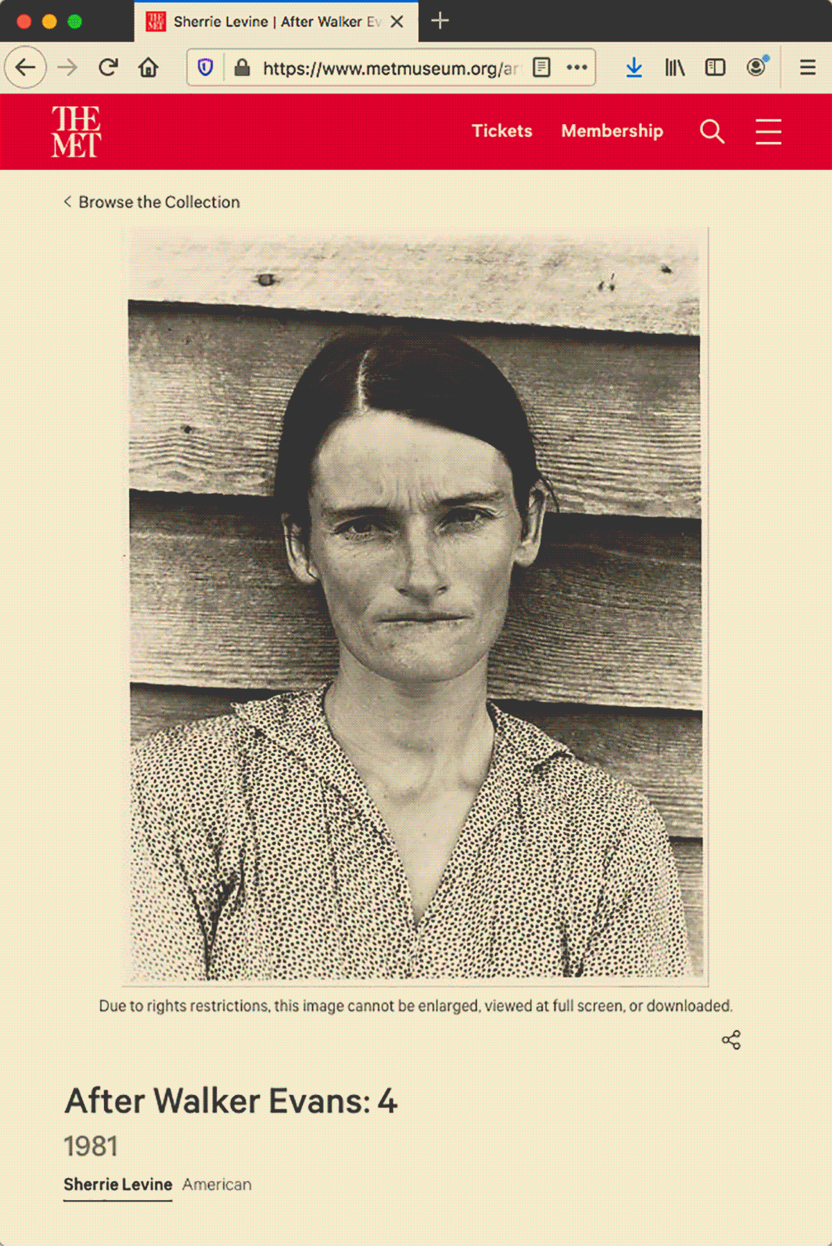
HG: You said they also have a copy of the Richard Prince photograph Untitled (Cowboy).
C: Yes. Oh, and in 2005 a different copy of Untitled (Cowboy) was sold for 1.2 million dollars, the highest price ever paid for a contemporary photograph at that point. Then in 2016, Time named it one of the most influential images of all time.
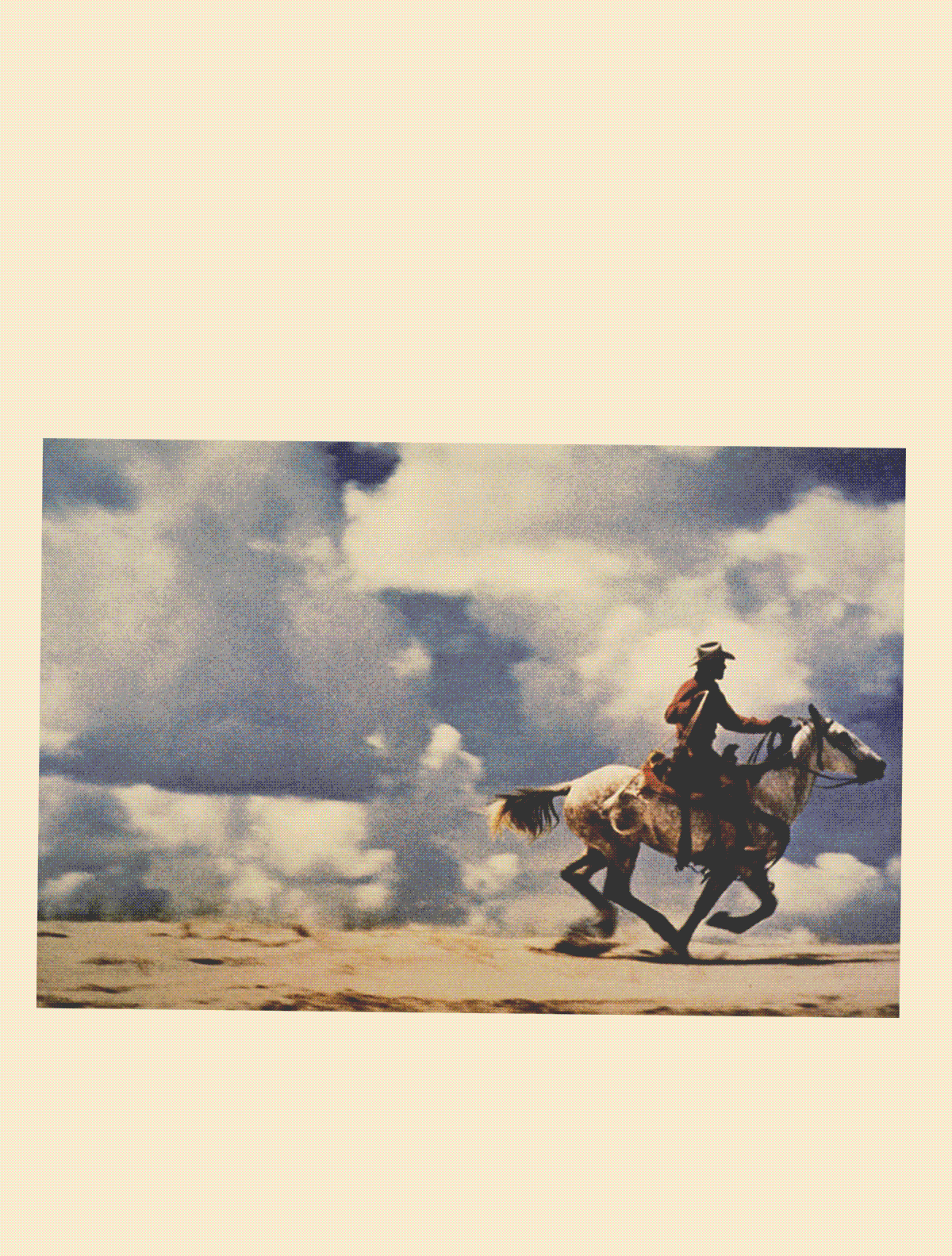
HG: Remarkable.
C: Yeah. And you know the story behind it. Richard Prince made the photograph in 1989 when he was employed in the tear-sheet department at Time. His job was to cut out magazine pages to send to advertisers to prove that Time had published their ads. Prince deconstructed the Marlboro ad by photographing the page without the logo, tagline, or Surgeon General’s warning. Prince isolated the man, the myth, the fiction… the commercial construction, the fabricated seduction. His photograph provided new insights and understandings. These are the kinds of results Judge Leval described as transformative and justifiably fair in his article about copyright law titled Toward a Fair Use Standard.
JUDGE PIERRE LEVAL: I believe the answer to the question of justification turns primarily on whether, and to what extent, the challenged use is transformative. The use must be productive and must employ the quoted matter in a different manner or for a different purpose from the original. If […] the secondary use adds value to the original — if the quoted matter is used as raw material, transformed in the creation of new information, new aesthetics, new insights and understandings — this is the very type of activity that the fair use doctrine intends to protect for the enrichment of society.
Transformative uses may include criticizing the quoted work, exposing the character of the original author, proving a fact, or summarizing an idea argued in the original in order to defend or rebut it. They also may include parody, symbolism, aesthetic declarations, and innumerable other uses.
C: Neither Marlboro or Sam Abell, the cowboy photographer, sued Richard Prince. In a video interview, Abell evidently does understand that Prince’s use was legal, but he calls it plagiarism, and he invokes the Golden Rule as if he doesn’t understand why the use was legal.
This next work does involve a lawsuit. In 2000, Jeff Koons’s assistants painted Niagara. On the fourteen-by-ten-foot canvas, they obscured Niagara Falls with ice cream and women’s legs. One pair of legs was copied from a photograph taken by Andrea Blanch, titled Silk Sandals by Gucci, published in Allure magazine. The painting was eventually exhibited at The Guggenheim, where Blanch saw it, recognized the legs, and sued Koons for copyright infringement in 2002.
C: This may seem like straightforward copyright infringement, but the Copyright Act of 1976 states that the fair use of copyrighted materials is not an infringement of copyright. Fair use can include reproduction for purposes such as criticism, comment, news reporting, teaching, scholarship, and research. Four factors are weighed in the determination of fair use, and they include the purpose and character of the use, the nature of the copyrighted work, the amount and substantiality of the portion used, and the effect of the use on the potential market for or value of the copyrighted work. All factors are supposed to be weighed together, but lately it seems like the first and fourth are the most important.
In Blanch v. Koons, Koons argued that his use was a comment on how people’s appetites for food, play, and sex are mediated by popular images in mass media, and that his paintings recontextualize images like Silk Sandals by Gucci in an effort to compel the viewer to break out of the conventional way of experiencing those appetites. He claimed that the photograph represented a ubiquitous fact in the world, something everyone experiences constantly, and that by using an existing image he could ensure that viewers would understand exactly what he was referring to.
JEFF KOONS: Although the legs in the Allure Magazine photograph ["Silk Sandals"] might seem prosaic, I considered them to be necessary for inclusion in my painting rather than legs I might have photographed myself. The ubiquity of the photograph is central to my message. The photograph is typical of a certain style of mass communication. Images almost identical to them can be found in almost any glossy magazine, as well as in other media. To me, the legs depicted in the Allure photograph are a fact in the world, something that everyone experiences constantly; they are not anyone's legs in particular. By using a fragment of the Allure photograph in my painting, I thus comment upon the culture and attitudes promoted and embodied in Allure Magazine. By using an existing image, I also ensure a certain authenticity or veracity that enhances my commentary — it is the difference between quoting and paraphrasing — and ensure that the viewer will understand what I am referring to.
HG: You could say something similar for much of your work.
C: I know. And Koons’s use was found to be transformative. The court understood that the use of an existing image advanced his artistic purposes.
Okay one more court case. Back to Richard Prince. In 2008 he created around thirty paintings for a series titled Canal Zone. His source material included many photographs torn from the pages of a book titled Yes Rasta by Patrick Cariou. Gagosian exhibited the paintings in 2008. Cariou recognized his photographs in the paintings, and sued for copyright infringement in 2009. The district court decided in Cariou’s favor primarily because Prince admitted that his paintings didn’t comment on or critique Cariou’s photographs, and Prince was ordered to destroy the unsold paintings.
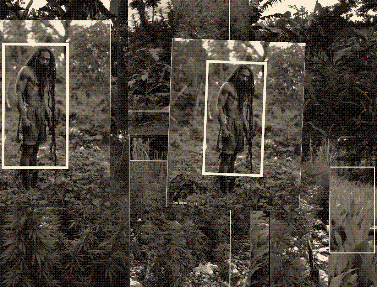
C: Prince appealed to the Second Circuit, and the decision was largely reversed. The court decided that fair use doesn’t depend on comment or critique. The paintings had creative and communicative results that were distinct from Cariou’s photographs, they weren’t a market substitute, and because the paintings were transformative, their commercial nature was of little significance. All but five of the paintings were declared fair. The remaining five were remanded to the district court to decide, but Cariou and Prince settled out of court on those. So Prince prevailed.
HG: Defending the legitimacy of art should not be so troublesome, so involved, so unpredictable. I don’t think for a moment that litigation and misguided judgments should permit the destruction of art.
C: Or that cease-and-desists should limit which art gets made. Or that chilling effects should restrict free speech. Or that takedown notices should be abused to suppress fair use.
Remix culture describes our contemporary society. Copyright law needs to be updated to account for common cultural practices, especially those that cause no harm to copyright owners. The purpose of copyright law is to promote creativity in society. It is supposed to balance the interests of owners and users, and it is insufficiently doing that.
Legal scholars like Darren Hudson Hick, E. Kenly Ames, and Roxana Badin advocate variations of presumptive fair use. They broadly agree that artistic appropriation should be considered presumptively fair when its function is social commentary, and when its purpose is to recontextualize recognizable images, to encourage viewers to reevaluate their understanding of those images. These are transformative strategies. It’s what Judge Leval was talkin’ about in Toward a Fair Use Standard. It’s what I’m talkin’ about here.
• •
HG: Let’s talk about it. Your websites appropriate the most relevant and quintessential mass-media brands for a given personal interest. How would you characterize the transformative strategies and the fair use purposes these websites have in common?
C: Mmm. Well. My websites recast corporate identity as personal identity, and personal as corporate. They adapt the organization to the individual, and vice versa. The originals often represent commercial, collective interests. Mine represent personal interests, and they introduce new expressions that mix fact and fiction, portfolio and archive. I’m the designer, developer, author, artist, photographer, et cetera. I do everything, so the result is a hierarchy-free multiplication of labor, and a portfolio of brands that directly corresponds with my interests, activities, and identity. It’s a kind of inverted corporate personhood that represents my corporate mentality. Part of my commentary is to say that those original, quintessential brands are the ones that establish presentational criteria for correctness. For example, Aperture establishes the criteria for correctness for the publication of fine-art photography, eBay establishes the criteria for correctness for online auctions, and so on. The most predominant visual languages provide coherent connotations that prime people to better understand the associated content. They come to signify their subject matter. I affirm this by submitting to their criteria, and I also suggest that each brand exerts a significant influence not only on culture and commerce, but on mind and memory as well. Food writers may imagine their words published in Bon Appétit; journalists, theirs in The New York Times; art critics in ARTnews. Things like that. And these people may adapt their writing and thinking to fit these forms. Quintessential brands shape our ideas and expressions. Using existing visual languages enables me to demonstrate this, and to test the viewer’s familiarity with each. I assert the value of visual literacy. I subvert the polarities of real and fake, original and replica, authentic and counterfeit. Other people will have insights and understandings that are as yet unknown to me. By necessity, there are visual similarities between my work and the originals, but no literate person would confuse mine for the originals. Mine aren’t market substitutes. They’re minor personal websites with distinct creative and communicative results.
• • •
HG: This page intrigues me particularly. Tell me about its function, its fair use purposes, and its mass-media connotations.
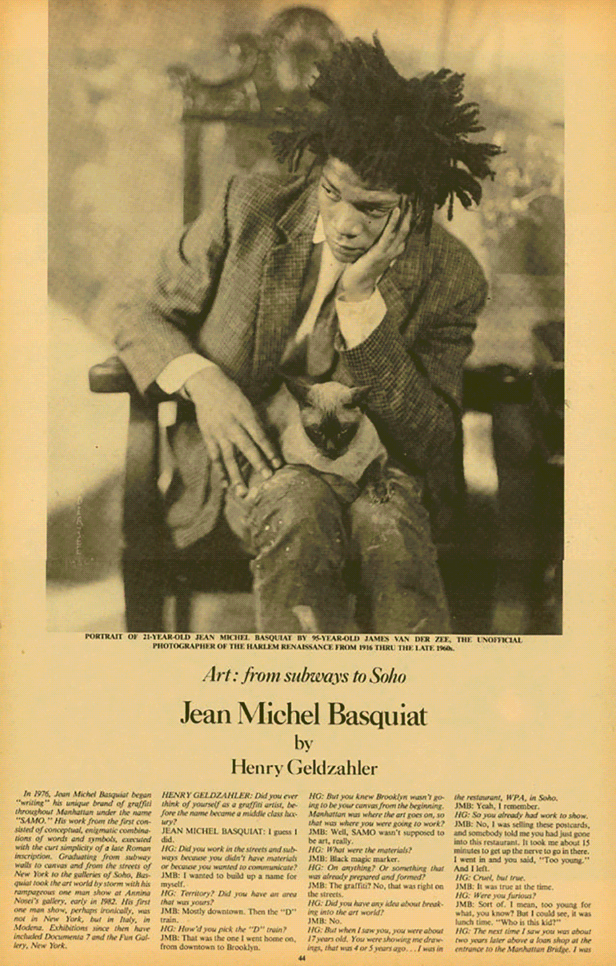
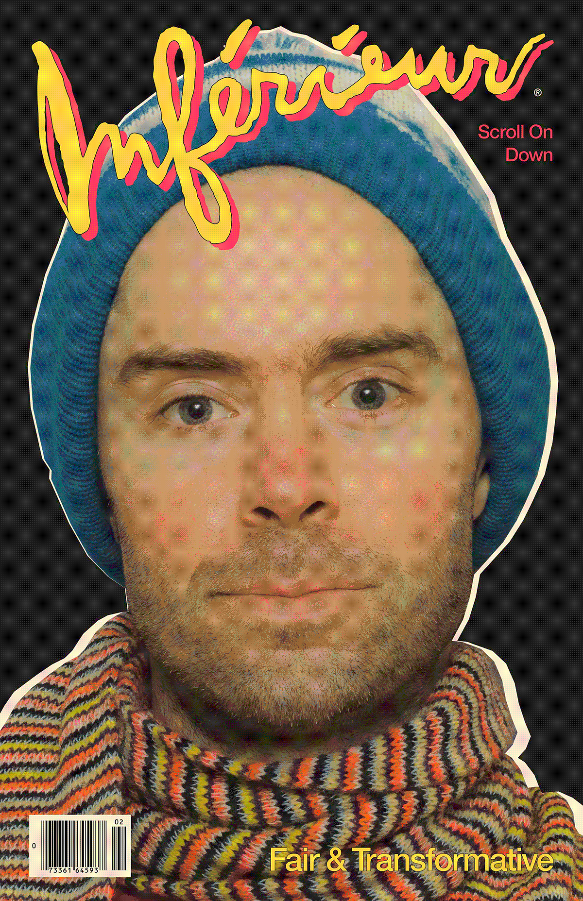
C: This page frames my art from first-, second-, and third-person points of view, and provides relevant precedents and historical context for my work. I’m using artistic appropriation as a teaching method to defend appropriation art and the fair and transformative use of copyrighted materials. The visual language here is based on 1980s print issues of Interview magazine, when it was known as the Crystal Ball of Pop.
C: When I realized Interview was the perfect mass-media archetype to adapt for my interviews, the clearest images I could find were scans of your January 1983 interview with Jean-Michel Basquiat. That’s why we’re talking. Within a degree of separation, the web of allusions for this page includes you and Jean-Michel, Andy of course because he founded the magazine, Richard Bernstein because he illustrated the iconic covers, James Vanderzee because he shot Basquiat’s portrait, and everyone we’ve discussed so far.
Critter, “Variations: Jean-Michel Basquiat & Critter,” 2021, GIF
s, 1200
PX × 1881
PX.
Sharts by
ShartURL, Courtesy
Gallery 98 &
Inférieur.
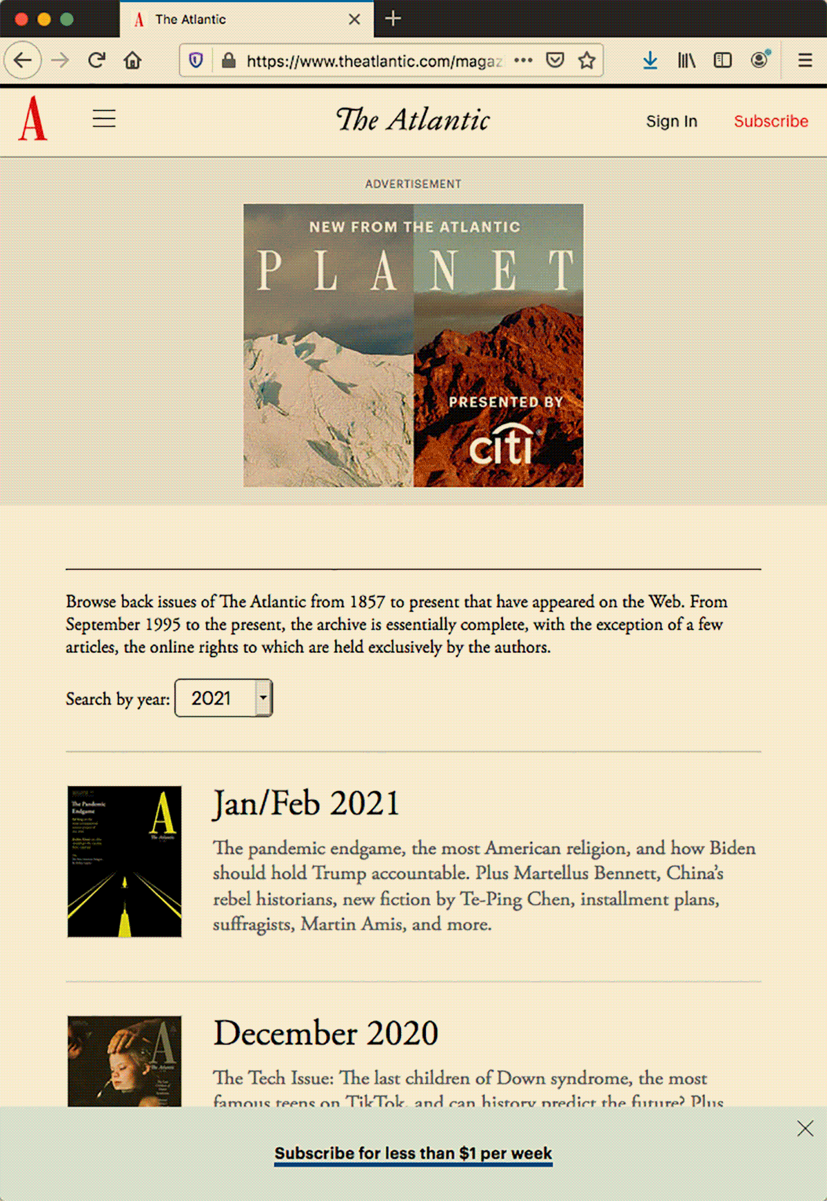
HG: If we go up a level, the page that brought us here is the Inférieur Back Issues page. Tell me about it.
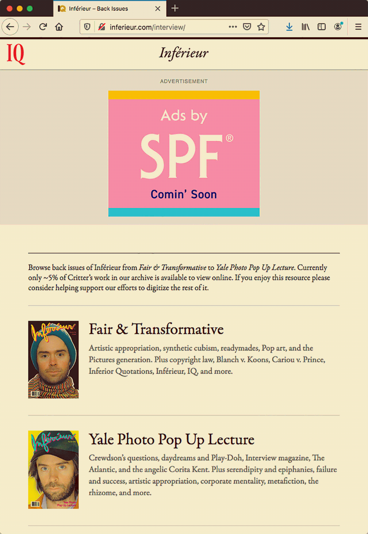
C: This page is a preview and portfolio of my interviews.
It’s modeled after the back issues page of The Atlantic. My use alludes to the magazine’s rich history. This includes the publication of writings like As We May Think and Letter From Birmingham Jail In As We May Think, Vannevar Bush predicts things like hypertext, the internet, and online encyclopedias. He describes associative trails, which I liken to the rhizome and the interconnectedness of my websites. Martin Luther King Junior wrote Letter from Birmingham Jail in response to white clergymen in Alabama who were opposed to the nonviolent civil rights demonstrations led by King and others.
MARTIN LUTHER KING JR.: Moreover, I am cognizant of the interrelatedness of all communities and states. I cannot sit idly by in Atlanta and not be concerned about what happens in Birmingham. Injustice anywhere is a threat to justice everywhere. We are caught in an inescapable network of mutuality, tied in a single garment of destiny. Whatever affects one directly, affects all indirectly.
C: Get it. The Atlantic has published many incredible articles, but I would reread those two first. In 2006, the Chicago Tribune named The Atlantic one of the top-ten English-language magazines, and the granddaddy of periodicals. In 2016, the American Society of Magazine Editors named it Magazine of the Year. This is the necessary quintessence I’m talking about.
HG: And if we go up one more level we get to the I.Q. Archives homepage.

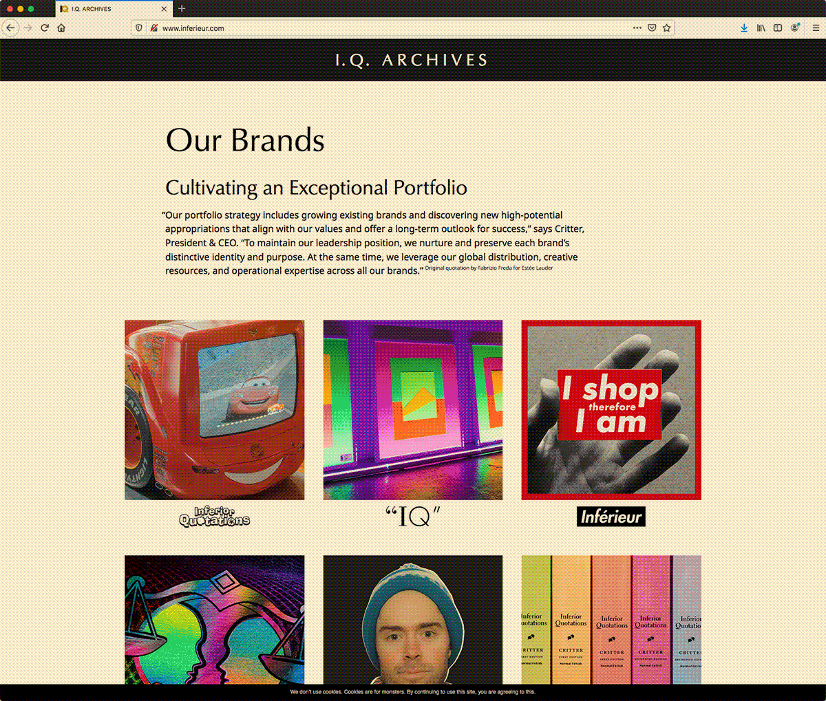
C: Yes. This page serves as the brand portfolio for all the Inferior Quotations, Inférieur, and IQ websites. The header and footer logos on each website link back to this page to encourage the exploration of all the sites in I.Q. Archives. On this page, I distinguish between each site by pairing its logo with a related image. The grid exhibits the importance of visual literacy, and confirms the power of connotations and visual identity. I.Q. Archives is based on the tastefully presented brand portfolio of Estée Lauder Companies, the global leader in prestige beauty. The tissue of allusions connects with exemplary people like Estée Lauder, who was the only woman on Time’s list of the 20 most influential business geniuses of the 20th century. And Frederic Malle, Editor of Editions de Parfums Frédéric Malle, who strikes me as the perfume industry’s equivalent of Gerhard Steidl. Each an editor without equal.
HG: And if we click the picture of tacos?
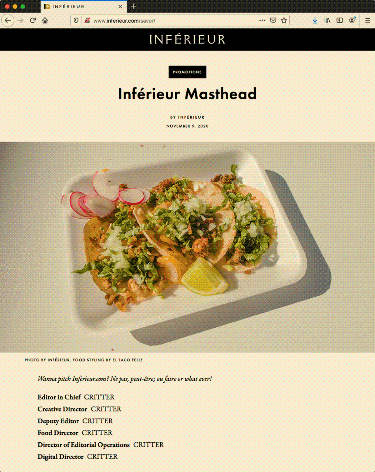
C: That takes us to my food website. Right now there’s only the masthead, but eventually I’ll use the site to share food and drink recommendations, recipes, and pairings. Like toothpaste and pickles. The website references two widely recognized food magazines. The webpage is based on Bon Appétit, one of the longest-running food magazines, and the logo is based on Saveur, winner of 33 James Beard Awards.
HG: There are self-allusions too. The photograph’s caption says Photo by Inférieur, which refers not to the food website but to your photography website.
C: Yeah. It’s a little associative trail, and a reminder of the interconnectedness of everything. Hey Henry I’m getting tired.
HG: Tell me about the photography site.
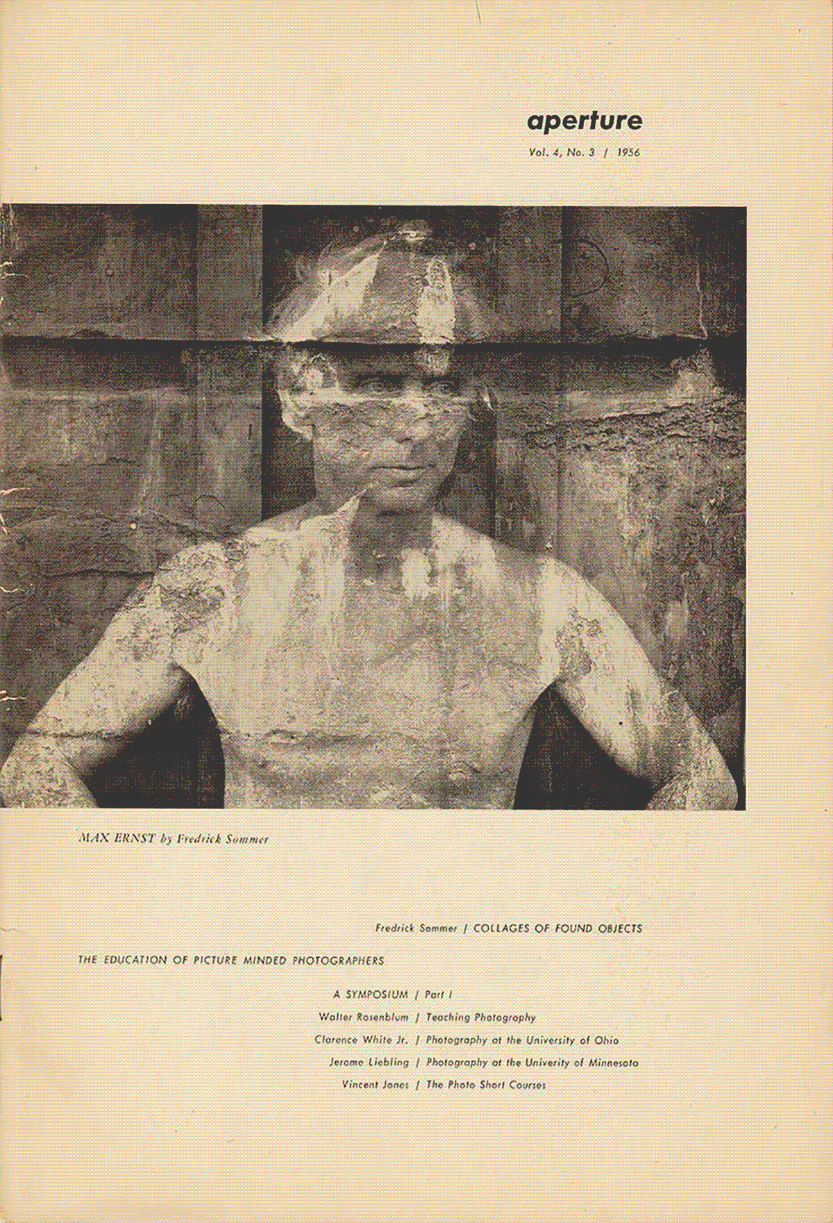
C: Okay. The Inférieur photography site is inspired by the simplicity and elegance of early print issues of Aperture. The magazine was founded in 1952 by a small group of photographers which included Ansel Adams and Dorothy Lange. Since then, Aperture has published many of the world’s most celebrated photographers, and it’s been the leading magazine exploring photography as a fine art. So by referencing Aperture, Inférieur gets connotations with Gregory Crewdson, Cindy Sherman, and the many other people they’ve published.
Each Inférieur photo series is presented as a book and a slideshow. The descriptions extend the references to people like Louis Leroy, and they frame my photography from a third-person point of view. The cover images are inspired by quintessential publications like National Geographic and Ed Ruscha’s artist’s books. Things the mind already knows. How many times have I said that? National Geographic is one of the most widely read magazines of all time, and Ed Ruscha’s artist’s books practically define the genre.
Critter, “Variations: Ruscha Lots & Critter Spots,” 2020, GIF
s, 1200
PX × 1483
PX.
Photograph by
MoMA Staff, Courtesy
MoMA.
HG: Digital books seem like a natural extension of Normal Fetish and Things Change Over Time. What is the relationship between your publishing companies and I.Q. Archives?
C: Umm, I first published Inferior Quotations as a book under the Normal Fetish imprint of Things Change Over Time in 2016. The book is a collection of personal thoughts and statements, arranged as a sort of narrative, in a format that appropriates Bartlett’s Familiar Quotations. I considered my collection of quotes to be inferior to Bartlett’s, but what I didn’t realize was that the book itself, as a work of artistic appropriation, could be considered an inferior quotation of Bartlett’s Familiar Quotations. Ughhh. So a few years after publishing Inferior Quotations, I learned more about appropriation art, and I realized most of my work could be considered an inferior quotation of its precedent. As in for instance, the webpage these words are on is an inferior quotation of Interview magazine, and so on. So I revived the name Inferior Quotations, and added Inférieur and IQ, and eventually I.Q. Archives. So it’s Normal Fetish and Things Change Over Time’s fault we have I.Q. Archives.
HG: And the website for Things Change Over Time?
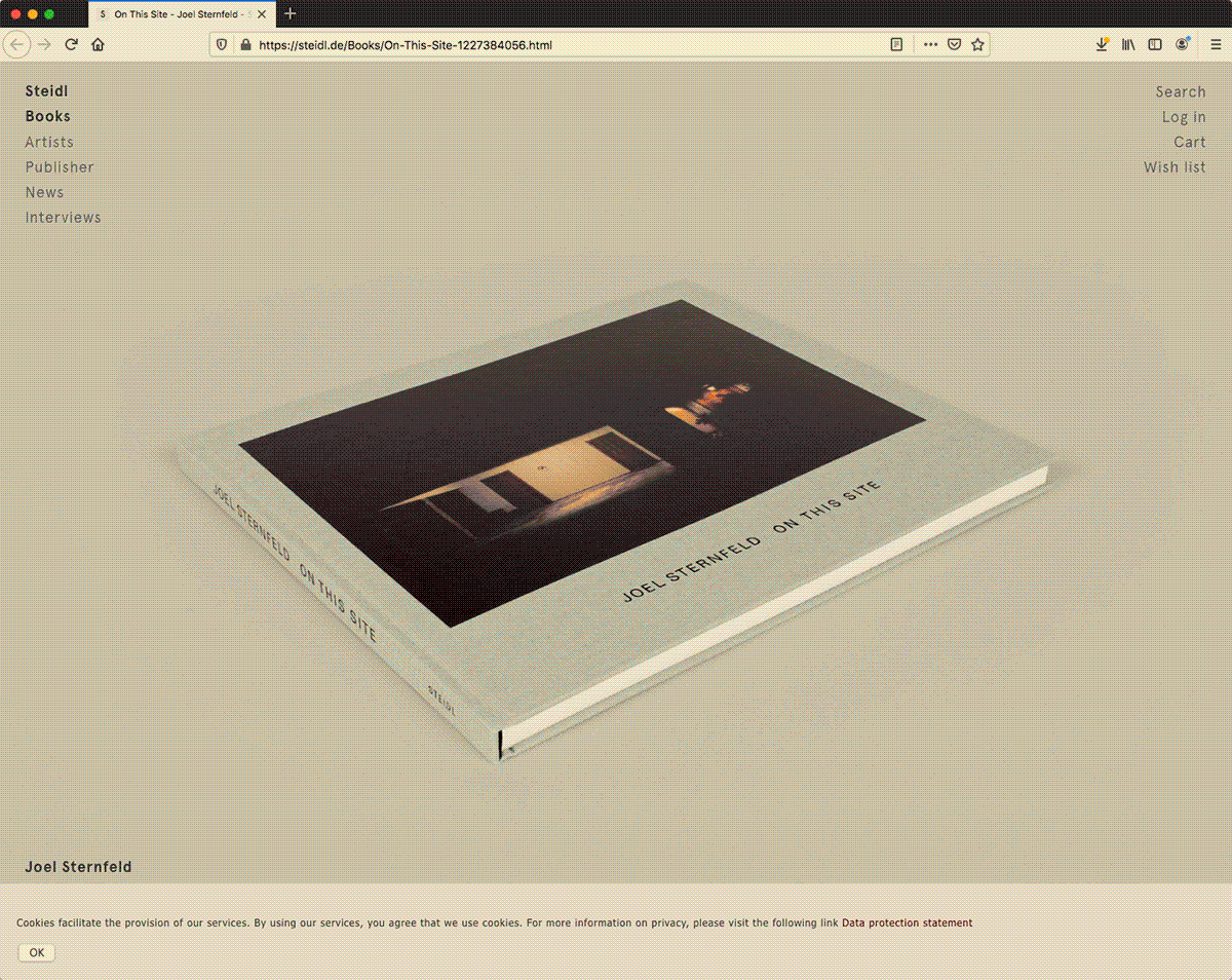
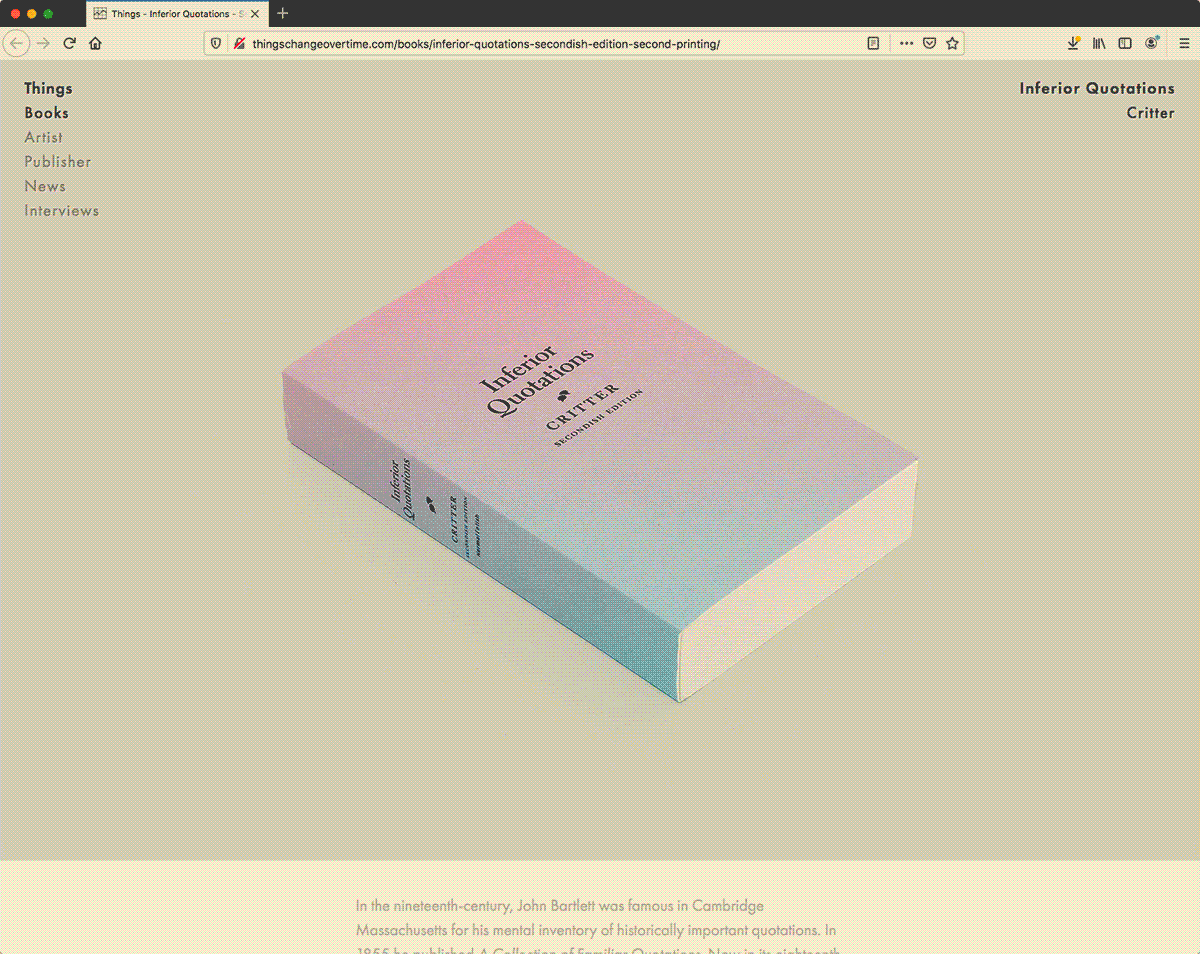
C: I use the Things Change Over Time website to provide historical background, and present my books from a third-person point-of view. It’s based on Steidl, who’s a peerless artistic facilitator. I’m fascinated by people like him, people who are so dedicated to their craft. By referencing Steidl, Things Change Over Time has a tissue of allusions that connects with the authors, artists, and photographers he publishes, and they include Ed Ruscha, Joel Sternfeld, and many more.
HG: Let’s talk more about websites in I.Q. Archives. What is the purpose of the Headlines page.
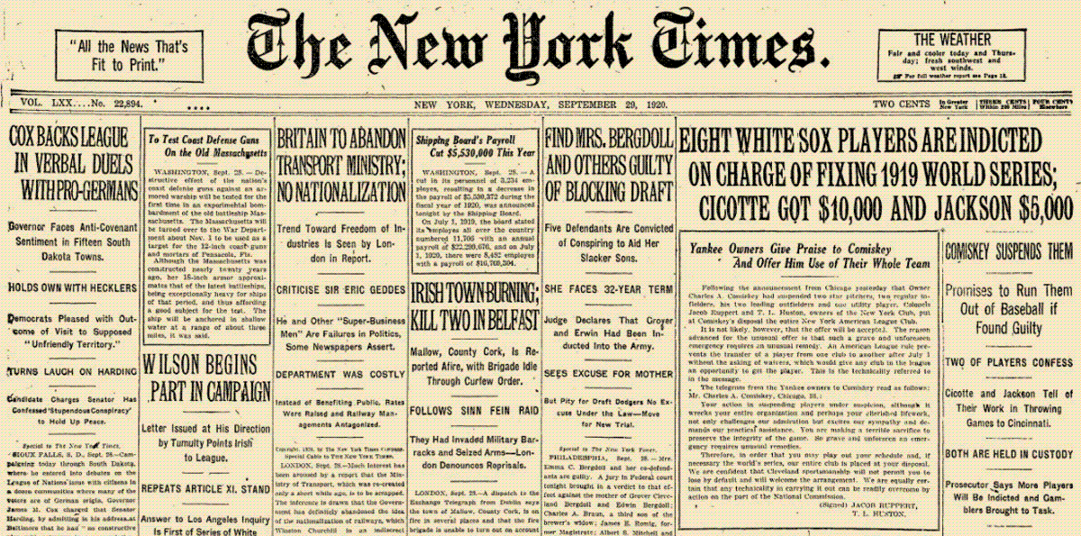
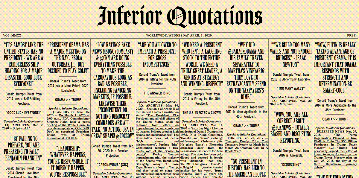
C: I made this Inferior Quotations to publish commentary on current events, and to highlight Donald Trump’s hypocrisy by recontextualizing his tweets. I last updated the content in March 2020, when the U.S. had recorded only 217 Coronavirus deaths and Donald Trump was our president. It’s an embarrassing time capsule. I designed the page to resemble the front page of The New York Times from a hundred years ago. The New York Times is yet another icon of excellence, and winner of more Pulitzer Prizes than any other newspaper.
HG: This one Inférieur website looks like an homage to Barbara Kruger.
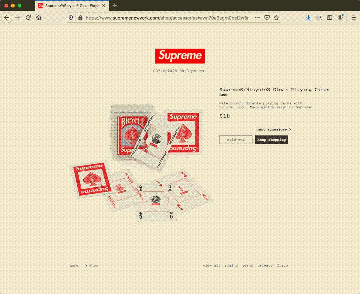
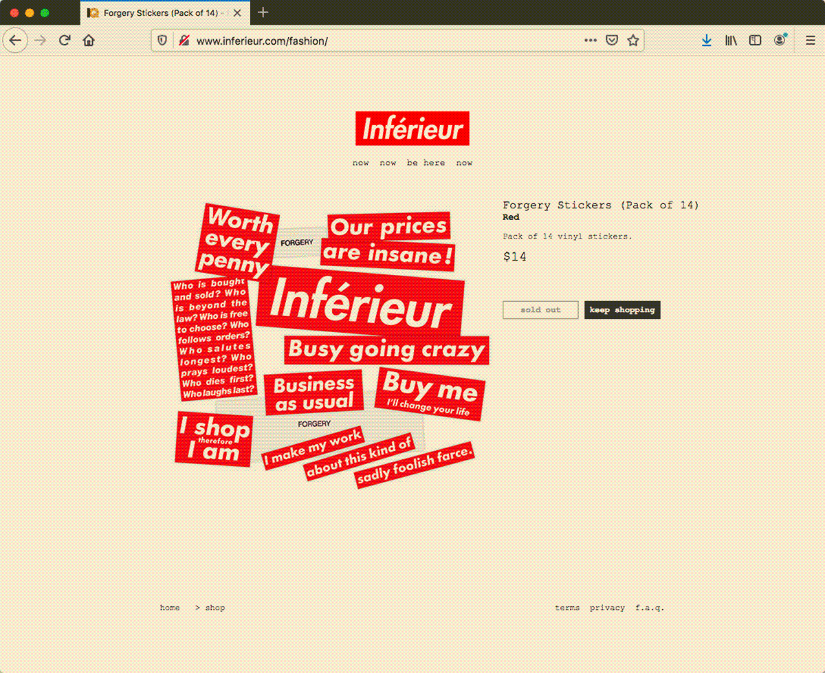
C: Yes, partly. It’s a lot of things. It functions as the primary market for Inférieur merchandise and accessories. Right now it features the Fall-Winter 2020 product, which was a sticker pack inspired by Barbara Kruger and Supreme. Kruger is an appropriation artist associated with the Pictures generation, and her art is among the most distinct and recognizable. Supreme is the king of streetwear, and the most hyped brand in the world. My stickers replicate messages from Kruger’s consumerism-conscious work, and they gain new meaning within the conspicuous-consumption framework of a website modeled after Supreme’s. Stamped as forgeries, the stickers allude to Supreme’s early, unsanctioned appropriations, including the adoption of Kruger’s style for their famous box logo. The stickers entertain the tension between Kruger and Supreme, and include a reference to fools.doc. Like lots of Supreme merchandise, the Forgery Sticker Packs sold out immediately, and are now only available on secondary markets.
HG: Authenticity and value are recurring themes in your work. Tell me about the coins.
C: Yeah, some time last year I made this set of penny paintings. I wanted to have them authenticated and graded by NGC, the world’s largest and most trusted third-party coin-grading service, but their website says they refuse to encapsulate coins with altered surfaces. So I established IQ to authenticate and grade the paintings myself.
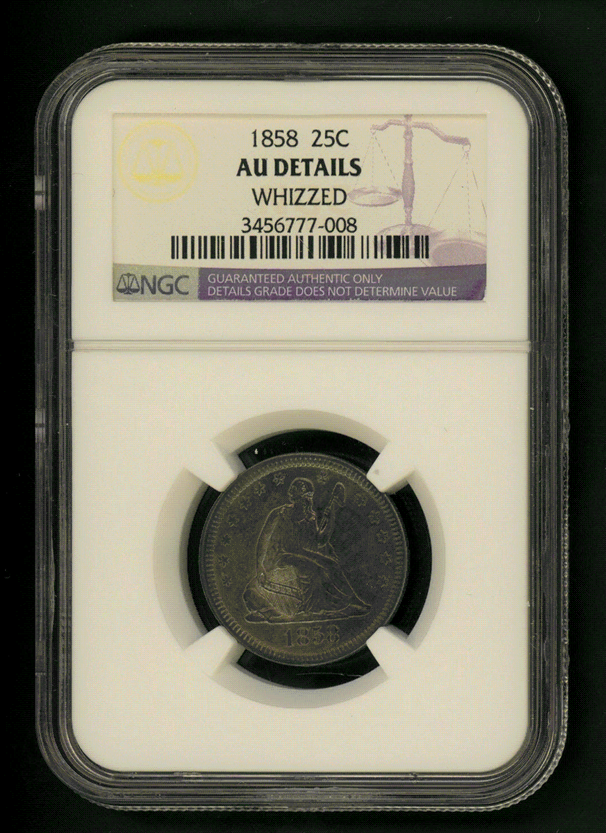
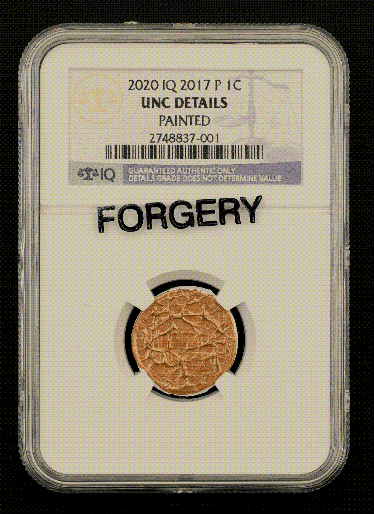
C: IQ was the first grading service to introduce Painted as a surface condition, specifically for these penny paintings. Because the paintings were all slabbed before leaving my studio, each received the most coveted grade of Uncirculated Details. To protect against counterfeits, the back of each holder has an IQ-logo hologram. Every coin authenticated and graded by IQ is published on the website, along with high-resolution obverse and reverse photos, certification details, auction history, and current value according to the IQ Price Guide. I replicated the NGC-eBay affiliation by making IQ an approved grading company of TimesWhat.
HG: There’s something very Duchampian about TimesWhat, ordinary objects elevated to works of art.
C: Oh, Warholy too. Stuart Pivar talked about how Andy’s intent with his junk collection was to buy cheap and sell dear, but how he never sold any of it. Then I’m sure you remember a year after Andy died, Sotheby’s auctioned off his possessions and the cookie jars sold for like two hundred times their estimated price. I got the idea for TimesWhat from a certain thing I bought cheap, and I made the website because I not only wanna sell dear, but also wanna digitally exhibit and archive these things, too.
C: Another reason I made TimesWhat is because eBay is insufficient for my purposes. Listings are ephemeral, auction winners are undisclosed, and there are limits to outbound links. On TimesWhat, completed auctions remain online, winners are shown so provenance can be known, and links can be used for anything. TimesWhat emphasizes the art of the listing, the art of the description, the art of the transaction.
HG: The art of the unopened package
C: Yeah, there’s a Ray Johnson, Jeanne-Claude, and Christo element in there. It’s all art. Everything we do is art.
HG: Why did you choose eBay as a model?
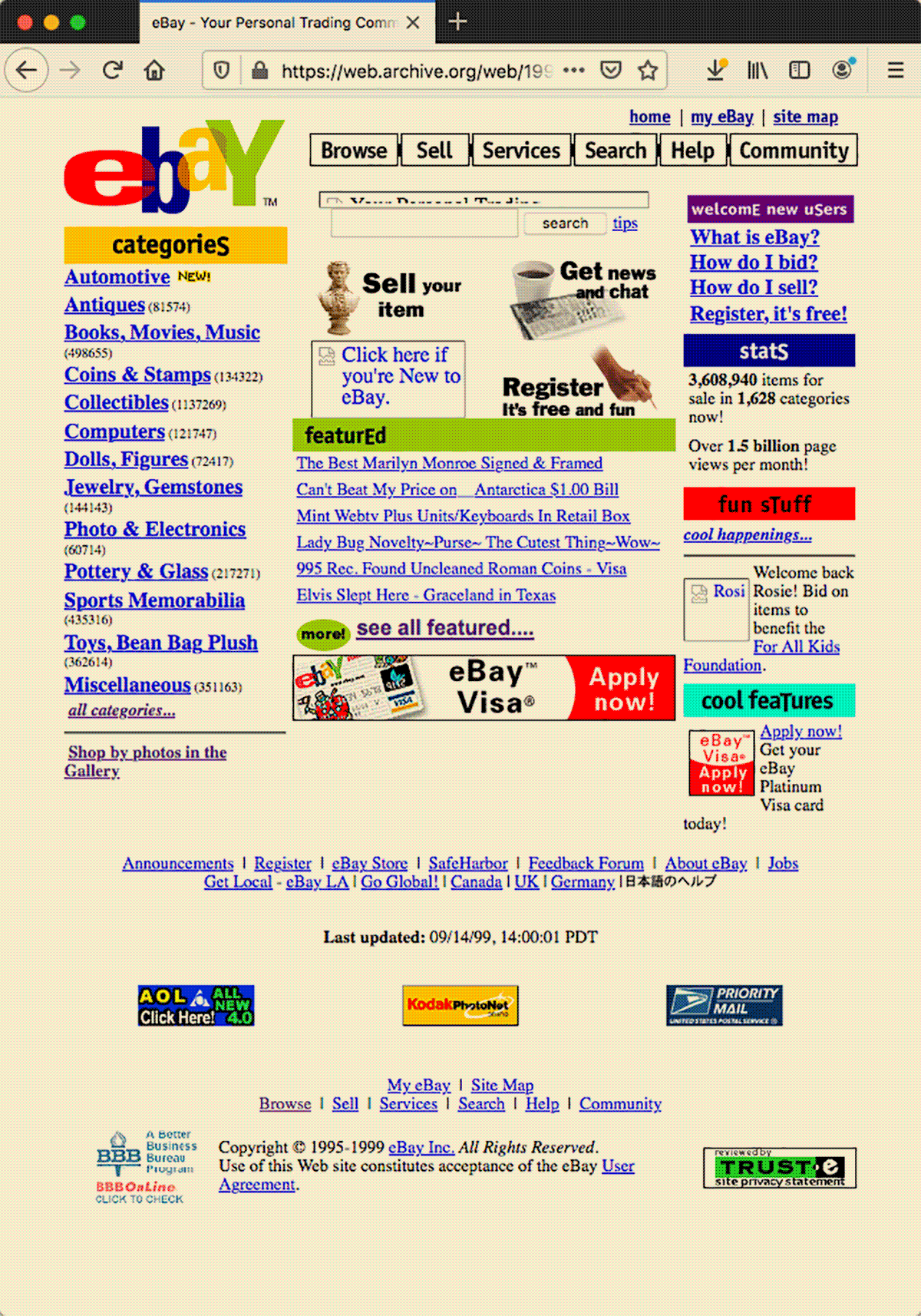
C: It’s the world’s largest auction site. It’s quintessential like everything else I choose. But there are nostalgic reasons too. I chose the Y2K-era eBay design because that’s when I started using eBay. It was also around then that I first viewed the source code of a website, which was eBay’s. I thought I had uncovered a secret I wasn’t supposed to have access to, and I imagined using it to make a duplicate eBay site to scam people with. So that was twenty years ago. Recently I needed a secondary market for my art, and adapting eBay was the only option.
HG: Would you say Rent-A-Critter is the rental equivalent of TimesWhat?
C: It was a precursor. It helped me form the idea for TimesWhat. I made Rent-A-Critter because I wanted to share my art with people, but I also wanted it back after a while. I wanted to rotate art among people and places, and I wanted to generate an alternative kind of provenance. I also wanted people to get close to my art, to see it in different places, at different hours, under changing light, day after day. That’s how I most appreciate it.
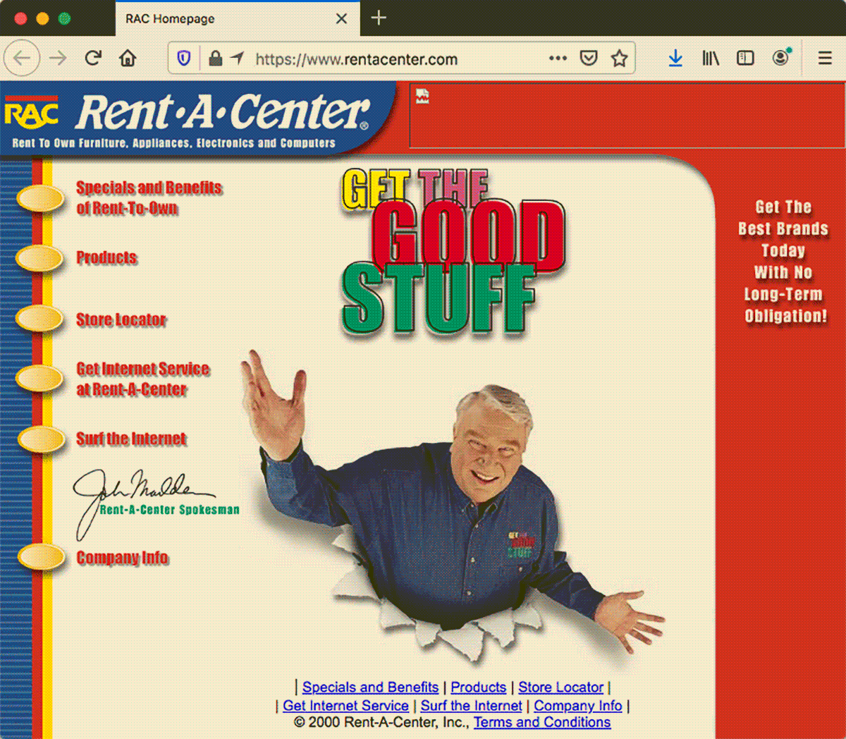
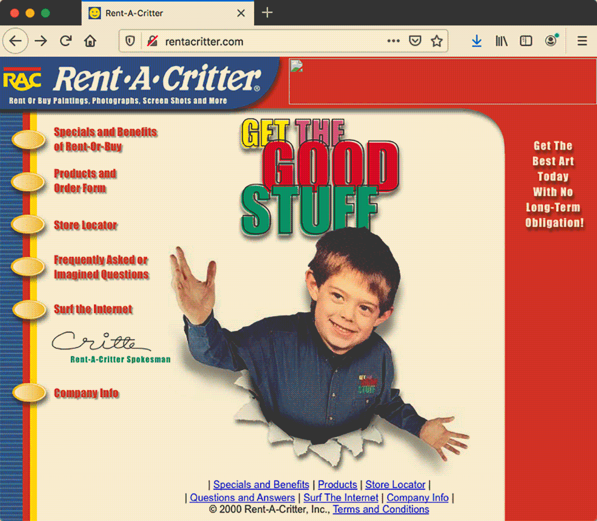
C: I modeled the website after Rent-A-Center, which is the largest rent-to-own operator in the United States. Again, something people are already familiar with. Rent-A-Center specializes in mass-produced goods like furniture and electronics, and Rent-A-Critter specializes in unique items and works of art, so there’s no market substitution. I got the idea for market as portfolio, market as archive while making the Rent-A-Critter Products page, and I further developed the idea with TimesWhat.
HG: Your work is an argument for contextualism. The Rent-A-Critter service recontextualizes your paintings and prints in the real world. The website itself, like your others, recontextualizes a familiar visual language, but it also repositions your work in a market setting. There are different meanings in each context. We haven’t even gotten to “IQ” yet. What is its differentiating function?
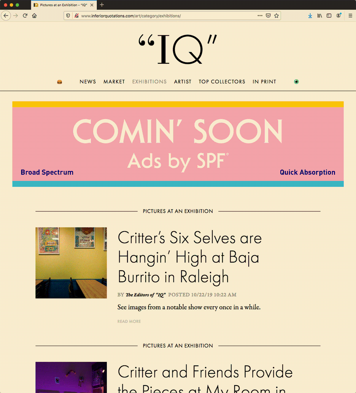
Critter, “Variations: ARTnews & “IQ”,” 2020, GIF
s, 1200
PX × 1324
PX.
Sharts by
ShartURL, Courtesy
ARTnews &
“IQ”.
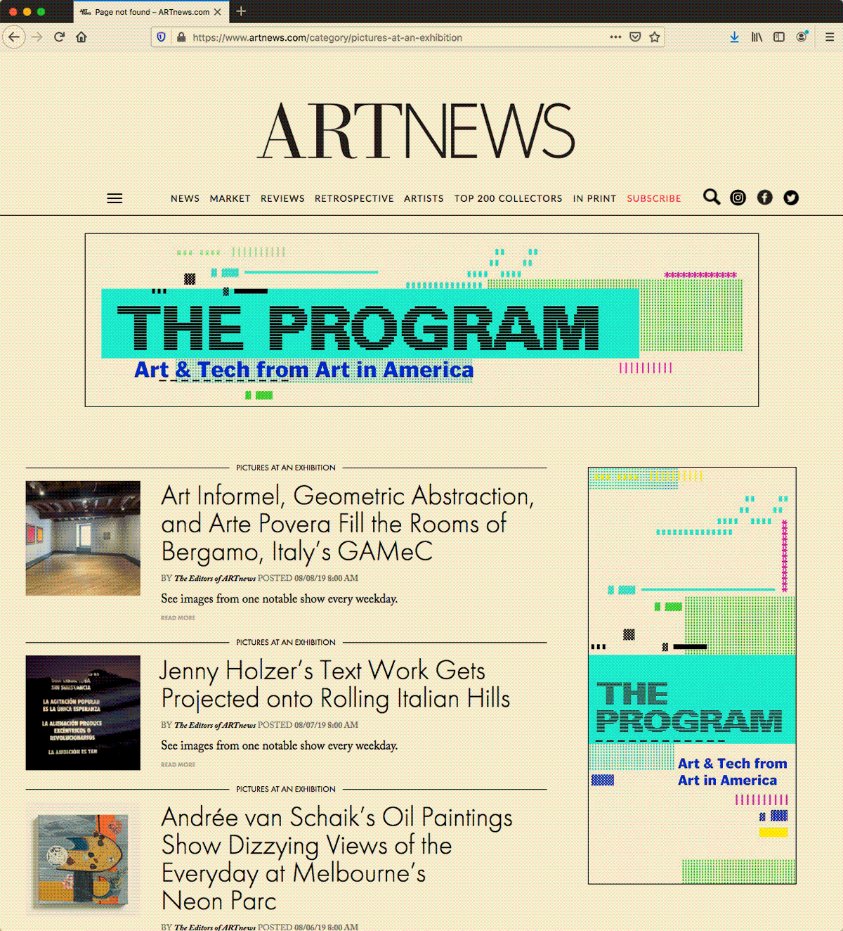
C: “IQ” provides an art-world context for my work. The website is based on ARTnews, which is the oldest and most widely circulated art magazine in the world. So my appropriation has general allusions to artists, writers, critics, collectors, galleries, and museums. ARTnews has features that work well for personal purposes. I adapted their News feature for general self-promotion, and their Market feature for things like Rent-A-Critter and TimesWhat. Their Pictures at an Exhibition feature, which I think they’ve since discontinued, seemed like the perfect template to promote my shows. The ARTnews features are formulaic. They provide a standard third-person point-of-view for me to adopt to promote my projects. The writing adheres to the styles and standards of the institution, so it’s uncreative in a way, but so is everything I’m doing.
HG: Your cinema website is arguably the least creative in this sense, but there’s a paradox with uncreative writing in that it can’t escape creativity. Describe what is creative about verbatim transcription.
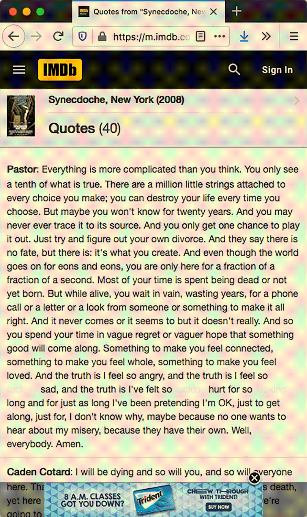
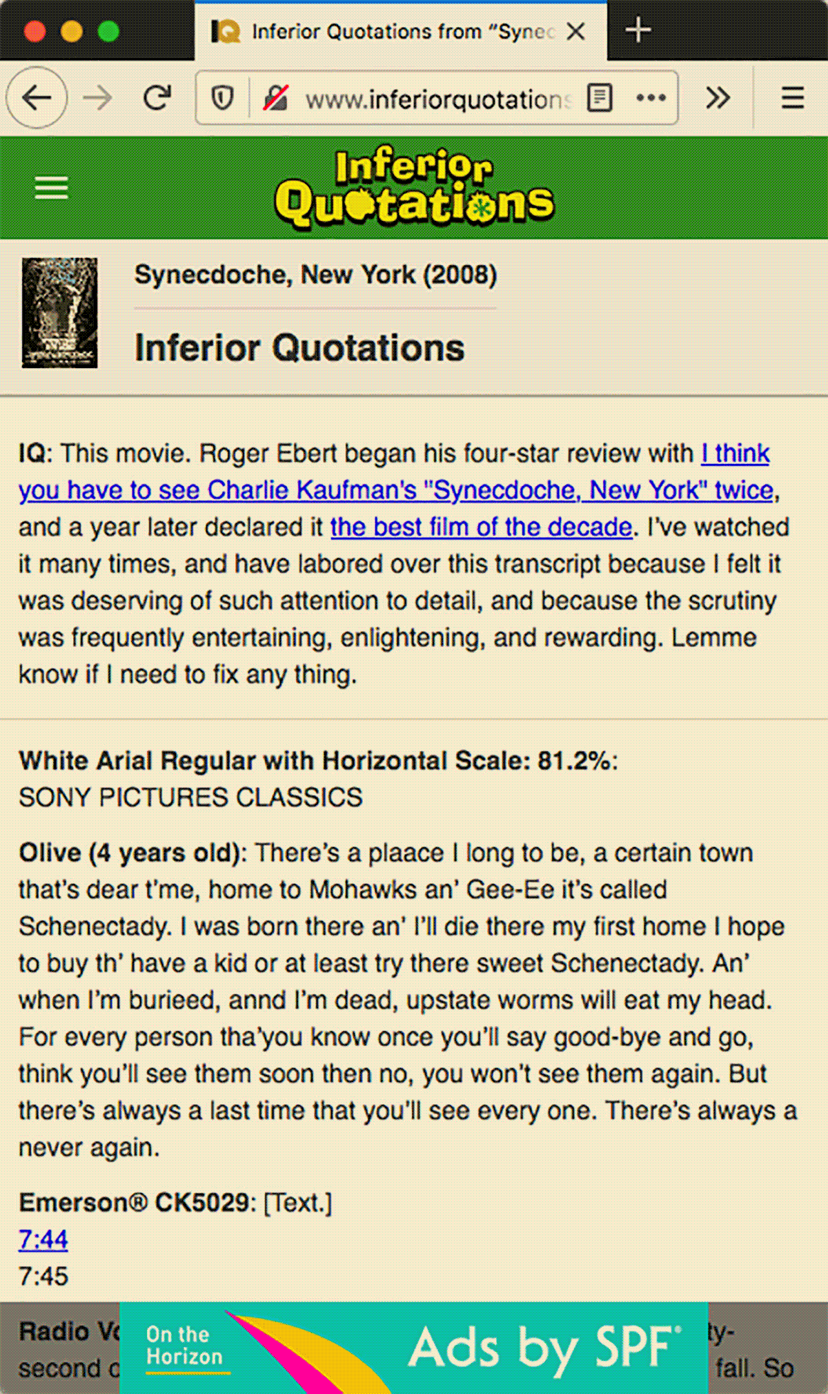
C: Well, movie quotes are available on lots of websites. Two of the most common sources are IMDb and Rotten Tomatoes. IMDb is the world's most popular and authoritative source for movie content, and Rotten Tomatoes is the most trusted film-review aggregator. Both websites provide crowd-sourced quotes with evidently no quality control. Flawed quotations are baked in. You can’t simply log in and edit them. Also, on IMDb, quotes are listed in order by Like ratio, rather than sequentially. It’s a mess. So Inferior Quotations is comment and criticism of that. I attend to details of speech perception, auditory phonetics, idiolect, and eye dialect. The results are more likely to elicit vivid memories of the actors’ actual spoken words. I want the actor’s voice, or the scene in the film to play in the reader’s mind when they read my quotes. And I want to demonstrate the value of this type of transcription, the value of precision. It’s more true, it’s higher fidelity. This stuff matters you know, true and false, real and fake. The website is modeled after IMDb, and the logo after the old Rotten Tomatoes logo. By using these visual languages, the differences are more pronounced. On my site I include amateur commentary, and I use links throughout to show intertextual relationships with other films, and to form associative trails from specific film quotes to related artwork and other websites and things. Users can’t do this with IMDb and Rotten Tomatoes quotes. By featuring specific films, I establish stronger allusions, and suggest what I’m inspired by or what I appreciate most. I think the first film I transcribed was Cultural Criticism and Transformation by bell hooks. Every sentence is potent and brilliant. Transcribing her words was a way for me to spend more time with them. The Hannity & Colmes segment with Christopher Hitchens and Ralph Reed was begging to be transcribed. It’s too good, and Fox News doesn’t do it justice. The closest thing to a transcript I could find for Synecdoche, New York was the goldenrod-revisions script, and then there’s the tiny selection of poorly recorded quotes on IMDb and the like. It’s so good, and I thought it deserved better. For each of these, my goal was to provide the definitive transcript. Lemme know if you see any mistakes. There are other films on the site that I’ve only transcribed a few quotes of, and there are others where I’ve documented things about the movie, but not necessarily in it. So there’s a variety.
HG: Many of your sites display advertisements that tease SPF. What does this refer to?
C: The future of online advertising. That’s what I’m workin’ on now that we’re done with this interview. (Laughs) ▢